Brand strategy and identity for independent financial planning firm
Carnethy Wealth
Carnethy Wealth was formed following the departure of a partner from an established financial planning firm. The business needed a new name, identity and clear positioning that would signal continuity for existing clients while confidently marking a new chapter.
This project focused on creating clarity and stability during transition.
The challenge
The firm had an established client base and reputation, but the change in partnership meant the previous name could no longer be used. A new identity was required, along with careful communication to ensure reassurance rather than disruption.
The challenge was to develop a brand that felt credible, professional and enduring, without losing the trust built over years of client relationships. The transition needed to feel intentional and stable, not reactive.

The approach
We began with light-touch strategy work to clarify positioning, audience and tone. This ensured the new brand direction aligned with the firm’s values and long-term ambitions.
From there, we developed a refined identity system to support the new name. The focus was on clarity and restraint. A clean typographic approach and considered colour palette were chosen to communicate trust, stability and professionalism.
We then supported the rollout of the identity across key touchpoints, including client communications and digital platforms, ensuring consistency and confidence during the transition.

The outcome
The result is a cohesive and professional brand presence that supports the firm’s new chapter while maintaining the trust built over time.
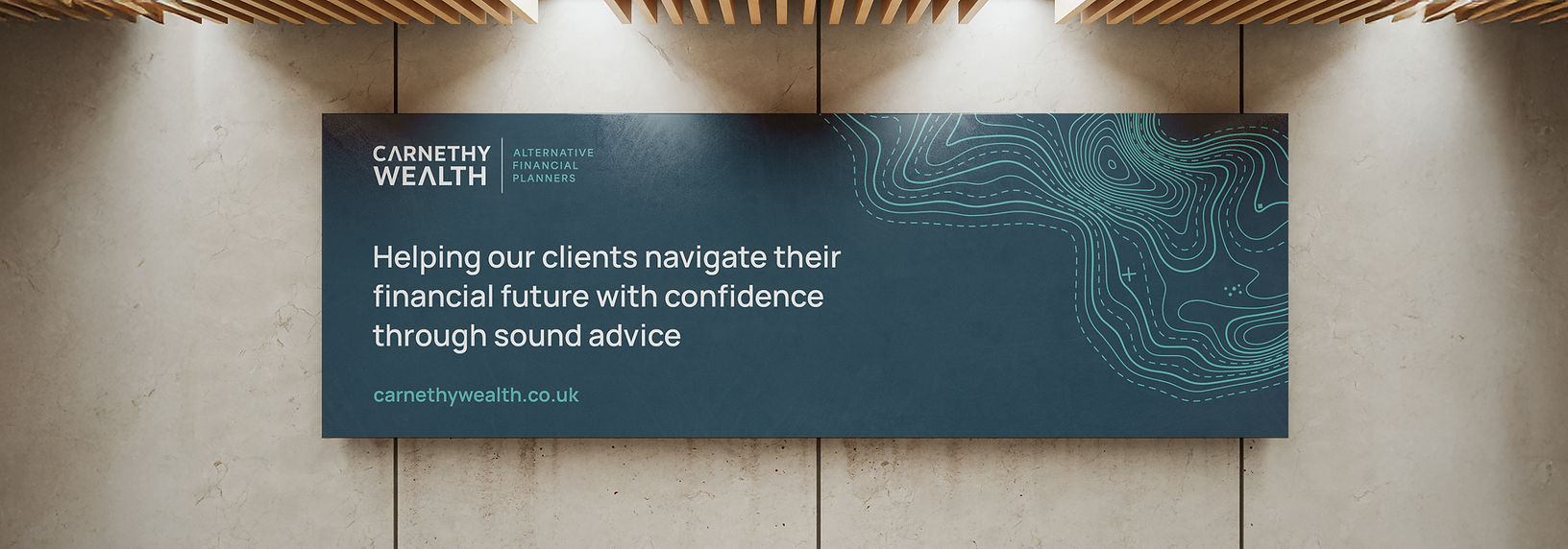
The refined wordmark includes an integrated mountain form within the letter A, symbolising upward progression and resilience. This subtle detail reflects the advisor’s role in guiding clients towards long-term financial success and steady growth.
Topographic map-inspired graphic elements were introduced as a supporting device. These reference landscape, navigation and direction, reinforcing the idea of guidance and structured progression. Used across print and digital materials, they add depth and distinction while remaining understated and professional.
The final identity system provides clarity and consistency across client communications and marketing materials. The transition under the new name was implemented smoothly, with a brand that feels stable, confident and built for the long term.

